
Hues Muse: Pink
A color series in which I explore facts and history about specific colors and how they can affect a person’s mood or impression of something. This series will include personal ideas, experiences and reflection as well as information and learnings from “The Secret Lives of Color” by Kassia St. Clair.
Pink is a polarizing color and as you dive deeper into specific hues you get even more opinions. It’s interesting that the color garners so many opinions as it is merely light red and the word pink didn’t originate until the late 17th century. The identification and naming of pink are unique since none of the other colors have different names for their lighter shade groups. and. Maybe calling out pink with its own name adds to the luxury and allure of the color grouping.
As a child I never had a strong connection to pink, in fact because my friend loved pink and I was expected to like pink (I’m a girl) I went in the opposite direction and decided that pink was ok, and most variations of pink were harsh and felt out of place. I’ve carried this attitude with me for most of my life, rarely buying any clothing or jewelry with pink, never buying pink household accessories and generally keeping my distance from pink. I’ve come to realize that while some shades of pink still deter me, I really like pink. As I have become more open to the color, I’ve been using it in my artwork and love how it can transform a painting, I find that the pink can be grounding and joyful.
Exploring the value of pink in my artwork has been fun and has made me want to explore the interpretations and history of colors. I think that the polarization of pink is not in the color itself but in the social labels and uses of the color. The use of pink and blue for gender identification only dates to the mid-twentieth century. In 1918 the gender colors were flipped as pink was considered “more decided and stronger color” while blue was, “more delicate and dainty.” One theory for this is that red was considered the most masculine color and pink is just faded red. While blue was associated with the Virgin Mary. The delineation of pink for girls and blue for boys is relatively new, is strong and still prevalent despite many efforts to get rid of the gender color labels and greater acceptance of pink in various places and for multiple uses.
You can apply many different meanings and feelings to pink but since the gender label still exists, one of the most common uses of pink is for feminine specific products. Recently the term ‘Pink Tax’ was coined to call out the increased prices of feminine specific products as compared to the male equivalent or generic products. Since these pink items are more expensive it also adds an air of increased quality or luxury. It is a privilege to be able to buy and use the higher priced female specific ‘pink’ product.
Now, does the impression of luxury apply to all shades of pink? Regarding household cleaning and hygiene products most are packaged to grab attention and use bolder or brighter pinks. But it is important to note that the shades of pink used for furniture and high-end clothing that give off luxury vides tend to be muted and softer. These softer tones also feel romantic and dreamy which make the color seem elevated and therefore more luxurious.
As you move to higher pigmented pinks the impression and opinion of the color gets more harsh and the appeal of the color becomes more polarizing.
For example, the color known as BAKER-MILLER PINK does not feel offensive and yet, many might have a negative connection to this shade and refer to it as ‘Pepto-Bismol pink.’ Is the color itself bad, no. But the unnatural color for a medicine and the uses and experiences people have with something of that color is what taints the impression of the color.
However, research shows that this color has a calming effect. A study published in 1979 illustrated that when men stared at pink versus blue, they were weaker, surmising that pink made men less aggressive. In 1979 two officers (Baker and Miller) put the theory to the test by painting the entirety of prison cells the shade of pink now known as Baker-Miller pink. The violent incidents decreased tremendously, and similar findings were found at a California youth center.
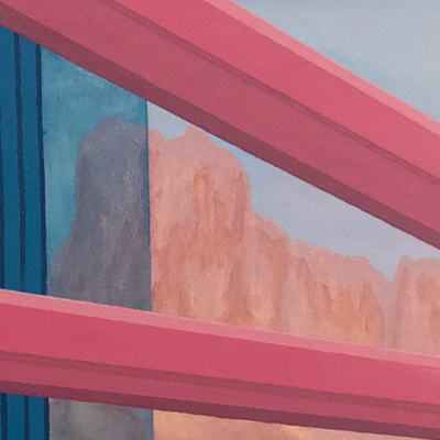
When used among other colors this pink can add a strong pop of color and contrast without being overpowering. I used pink in my painting “Tranquility A.T. Sullivan Canyon” for this reason. My goal was to include an element of surprise that could lead your eye through the painting. Pink felt like it had the right amount of contrast and is opposite of the color wheel of the greens used in the landscape of the painting. It wasn’t until I had completed and named the painting that I learned of the calming effects of pink, specifically Baker-Miller pink which strongly resembles the lighter shades of pink in “Tranquility A.T. Sullivan Canyon.” It makes sense now why I felt at peace when painting this piece and why I was moved to use ‘tranquility’ in the title. This piece grounding piece and adds color, serenity, and peace to any space.